http://lilipotterxo.wix.com/fatal-evaluation
Fatal OTS. Final Edit from Emily Apps on Vimeo.
Here, is the final cut of of our Opening Title Sequence for Fatal.
Sunday, 5 April 2015

Sunday, 22 February 2015
Feedback of our first cut
This is our first cut of the fatal opening title sequence. In order to ensure our media suited and attracted our target market we presented our OTS to the class and recorded our feedback. This allowed us to watch it back and improve our piece and suit it to our set audience. During our filming we left the room to ensure that the audience didn't feel pressured to give their own opening and in doing so would allow the group to be as open as possible.
Friday, 13 February 2015
Shot list
Today Emily and I are going to be filming additional shots to ensure that our OTS reaches our target duration of two minutes. We have analysed our footages and made a not of more shots we would like to add which will enable us to add in more titles and add more of a plot to our sequence. These shots are included below:


However, we did not get all of our filming done in one session therefore we had to film additional scenes in the dark room. As my main role was to sort out character's costume, location and props, I had to ensure that the actors where available to film and that we had all the necessary equipment for that scene.
Here are photographic examples of me aiding our actor, Adam Burton, prepare for filming. In the first one, my main objection was to ensure the costume was satisfactory for filming the scene. In the following two pictures I am ensuring that our actor is comfortable within his role, was equipt for the current scene and that the lighting and position was correct.
Monday, 9 February 2015
Post production log

We have decided to use Final Cut Pro to edit our sequence as we are more familiar with the programme meaning we are more confident with our ability to create original effects and will flow better aesthetically; this is because the programme includes more effects and settings than any other featured editing software and overall is more advanced.

In the first picture I am using the colour correction tool, which removes all colour in the clips except red hues. This tool in Final Cut Pro is a dropper selection tool that you can use to edit the saturation, exposure, and colour of a shot. This will give our OTS a noir type look by extracting all colours apart from red. This was included in our featured ideas in the beginning of our planning; this was inspired from our Sin City style.
In the second photo I have been using Final Cut Pro to experiment with effects and settings in order to create our idents. We are creating two in total, Red Products (As pictures) and another undecided company. I have created a blood splatter in photoshop and will apply the company name to This somewhere within the design. This picture also splatters onto the screen as I have found a transition on Final Cut Pro which allowed me to move the picture in order to create this.
I will in the future be listening to any feed back that my audience will have when viewing this to other peers and fixing any criticism within my field of work. I will also be working on another ident and filming other footage that has had problems featured above.
Ident further analysis
As a group, we have decent to change our idents into something related for the film industry. We have gather some feedback from other peers and the comment that our first ident 'Ink inc.' is more suited to a writing or graphic based company and does not represent a noir type film company which would be associated with our Film Noir Opening title sequence.
We have decided to not use this as it has been developed off of preset titles on Final Cut Pro and may be seen as unoriginal and not a product of our property.
Possible alternatives to this include:
- Street Light Productions.
- Including the light through blinds shot.
Emily and myself decided that Street Light Productions was clear in indicating that our media would establish the Noir genre. As she is the designated editor of our group we discussed some ideas that would help display the title on screen. She later started to develop some possible idents and came up with a few possibilities but decided upon this.
street light studios from Emily Apps on Vimeo.
Vimeo.
During the reconsideration of the idents we realised that the Red productions ident was low quality and i was not able to animate it in a way that we liked. Emily also changed this idea from the first red logo to the other below

RED ident from Emily Apps on Vimeo.
Possible alternatives to this include:
- Street Light Productions.
- Including the light through blinds shot.
Emily and myself decided that Street Light Productions was clear in indicating that our media would establish the Noir genre. As she is the designated editor of our group we discussed some ideas that would help display the title on screen. She later started to develop some possible idents and came up with a few possibilities but decided upon this.
street light studios from Emily Apps on Vimeo.
Vimeo.
During the reconsideration of the idents we realised that the Red productions ident was low quality and i was not able to animate it in a way that we liked. Emily also changed this idea from the first red logo to the other below
RED ident from Emily Apps on Vimeo.
Friday, 2 January 2015
Sound within films
We watched a clip of 'Priest'; a 2011 American post-apocalyptic dystopia, science fiction, action horror film starring Paul Bettany, in class and explored the use of sound and how it effects the film dynamically.
 We looked at the 5 main types of sound and how they were used/how effective they were within during the clip we watched. These 5 types of sound are as followed;
- Dialogue- Words/Vocals's
- Sound effect/Foleying- is it diegetic and is if added after?
- Soundtrack- Score/Music usually added in during editing.
- Ambiance- Background sound e.g Birds, rain, wind. Sets the mood.
- Silence- No sound.
Here is the clip we watched with addition to further analysis I have made.
- Dialogue- Words/Vocals's
- Sound effect/Foleying- is it diegetic and is if added after?
- Soundtrack- Score/Music usually added in during editing.
- Ambiance- Background sound e.g Birds, rain, wind. Sets the mood.
- Silence- No sound.
Here is the clip we watched with addition to further analysis I have made.
Production Plan
To be more organised within out group, we made a production plan consisting of what job each member of our group aims to do and when they need to achieve it. We plan to add to this list later throughout production.
Who?
|
Timescale/deadline
|
What/where?
|
When?
|
How?
|
Lilly SS
|
Before filming on the Friday 2nd.
|
Make sure camera is charged, enough storage on cards, organise actors and producers so that everyone is present at the right time.
|
Before and on the day of filming.
|
Communication between whom it may concern.
Any unneeded material on cameras or storage.
Be efficient.
|
Lily P
|
“ “
|
Find props and suitable location
E.g. Fake cigarettes, make fake blood, ect
|
Before filming.
|
Looking up online and seeing what props we have already between groups.
|
Emily
|
“ “
|
Bring second camera and tri-pod.
Assist in the setting up and shooting of the shots.
|
Day of filming.
|
Communication between whom it may concern.
Any unneeded material on cameras or storage.
Be efficient.
|
Together
|
“ “
|
Film and work together; ensuring that communication and errors in each other’s work is improve and evaluated
|
Day of filming and beforehand.
|
Refer back to the storyboard.
Use good communication between group members and share ideas.
|
Sunday, 28 December 2014
Lighting
To help with my understanding of film Noir and our work in our Opening Title Sequence,I found that lighting is a very important feature that is used within noir; It is used as a device that helps set the mood and mystery.

High Key Lighting:

Low Key Lighting It is a necessary element in creating a chiaroscuro effect. Traditional photographic lighting, three-point lighting uses akey light, a fill light, and a back light for illumination. This kind of lighting is usually used in black and white filters or in shadowed or dark scenes and photos. It accentuates the contours of an object by throwing areas into shade while a fill light or reflector may illuminate the shadow areas to control contrast. The relative strength of key-to-fill, known as the lighting ratio, can be measured using a light meter. Low key lighting has a higher lighting ratio.
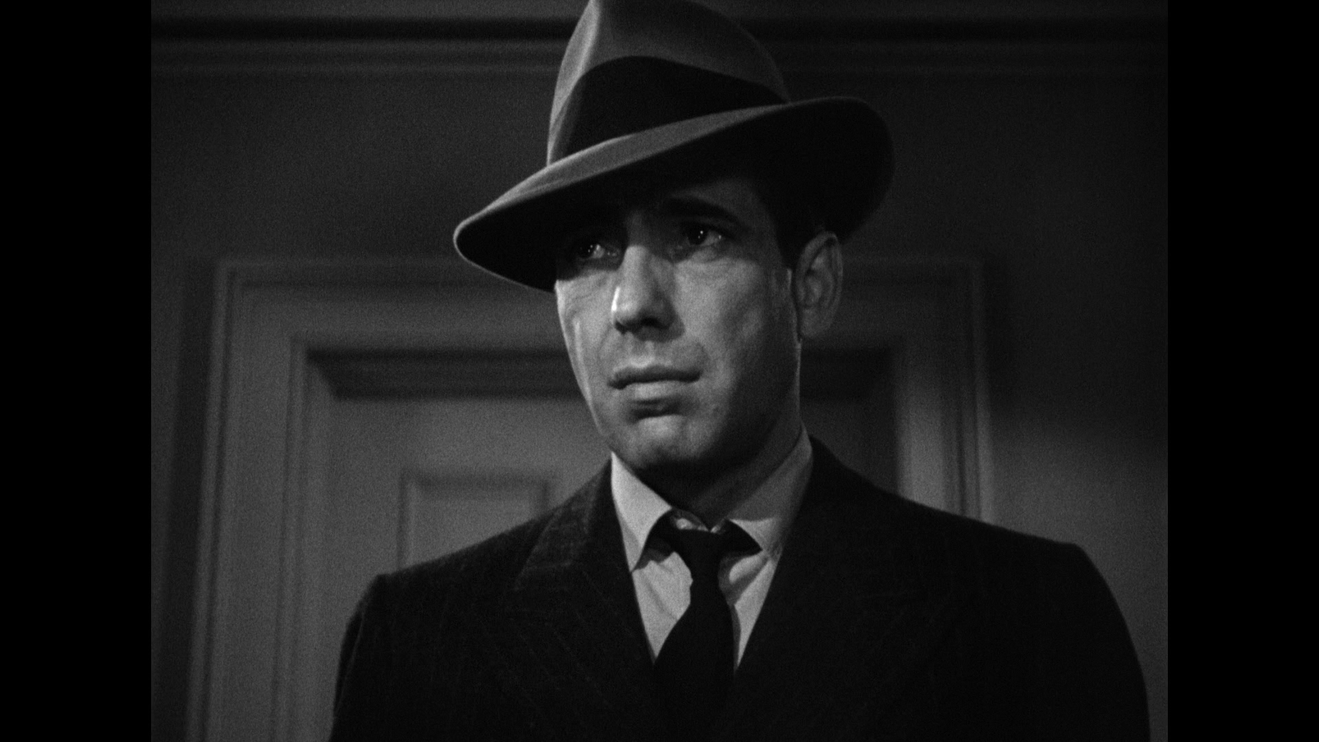
Within our OTS we are considering to mainly focus on Low key lighting. To do so we will have to consider avoiding intense shadows as the primary element of the composition. It will also have to be filmed in an interior location as manipulating our lighting and the positioning of our actor so that the shadows fall in just the right spots to create the look we want.
High Key Lighting:
high key lighting aims to reduce the lighting ratio present in the scene. This was originally done partly for technological reasons, since early film and television did not deal well with high contrast ratios, but now is used to suggest an upbeat mood.It it now currently a style of lighting for film, television, or photography. High key uses unnaturally bright lighting to blow out most or all harsh shadows in an image. this method was originally developed as a solution to screens that couldn't properly display high contrast ratios, but has developed into more of a stylistic choice; perfect for a subject that is funny, lighthearted or beautiful.

Low Key Lighting:
Within our OTS we are considering to mainly focus on Low key lighting. To do so we will have to consider avoiding intense shadows as the primary element of the composition. It will also have to be filmed in an interior location as manipulating our lighting and the positioning of our actor so that the shadows fall in just the right spots to create the look we want.
Lighting within our ots
When filming our OTS I mainly stuck to these sides of the camera. Although we did not use the same equipment in the one stated below. This ensured that we would get the best shot in our OTS as by using the techniques below this would allow a shot that was well contrasted without a glare on the camera.

Friday, 19 December 2014
Neo Noir
There are many sub genres of film noir and one of which is Neo Noir. The definition is as following:
Neo-noir (Translated as 'New Black') is a style often seen in modern motion pictures and other forms that prominently utilize elements of film noir, but with updated themes, content, style, visual elements or media that were absent in films noir of the 1940s and 1950s.


Neo-noir (Translated as 'New Black') is a style often seen in modern motion pictures and other forms that prominently utilize elements of film noir, but with updated themes, content, style, visual elements or media that were absent in films noir of the 1940s and 1950s.
To understand key features of the Neo Noir genre, we looked at clips in class of 3 films classed as the Neo Noir genre. We also made notes throughout watching these clips to identify typical and non-typical aspects which helps us determine what makes the Neo Noir different to the Noir genre itself.
Our first film we watched was 1974 - The Red Riding Trilogy
Our second film was Bladerunner - set in 2019
The final film was Bound- set in 1990
When making our opening title sequence we will have to introduce the genre to the audience. Neo Noir will be a possibility for our OTS but we will have to compare the typical and non-typical characteristics with our own in order to find a fitting genre.
Wednesday, 17 December 2014
StoryBoard


Whilst Emily was producing our production company logo, Lilly and I have made a story board including camera positions and angles shown through illustrations.
Most of the shots here are shown using iconography through mise-en-scene that I have made a post on below and are using our actors Bridie Magee, Adam Burton and Aidan Rawlinson.
This is our basic plot of our Opening Title Sequence however we may add in additional shots including our protagonist to show prevalence.
The first of our shots shows present day and starts with a close up of our femme fatal whispering into her lovers ear with the words 'Do you trust me?' echoes. A sound collage featuring a series of close up shots of her previous life of which she flirts with men.
 The next shot would include a front shot of the femme fatal blowing a kiss in slow motion. The sound of her breath when blowing which will create a sound bridge of the bullet being shot from the gun which will be our next shot. This will pan across where we see the anti-hero staggering as blood will seep through his shirt. This would transition into the femme fetal's hands claw down his chest which then cuts to a close up to her eyes with tears and makeup down her cheeks.
The shot will fade to black and cue titles. Our titles in order will include:
- A title rising from cigarette smoke.
- a glass of alcohol (probably beer in a bottle) and spills to create a title.
- Femme Fatale pulling up a stocking to show a title written on her leg.
- A credit card cutting cocaine with a title written on it. Although our OTS is inspired by old 1950's Noir, we have included current technology and features therefore our noir will be set in no mans land.
- Cards fanned out with poker chips in shot and the title written within the fan.
- A newspaper and a headline displaying our title.
- Lipstick written on a mirror.
We have not yet decided on specific titles and when they will be shown in our OTS however we have decided that we are going to show our main title 'Fatal.
Monday, 15 December 2014
Film Production Company Logo
Emily has made a logo. We thought our ots would look more authentic with a production company so we brainstormed names and we came up with the name 'RED'. This was because the main colour associated with Femme Fatales. Emily was left to create a logo and this is what i came up with.
 This was made the logo on Photoshop blood splats and manipulated them to create the letters.

We also came up with a studio name/company we called it 'inc. incorporated studios'. This was also created by Emily using Photoshop.
Friday, 12 December 2014
OTS- experimenting with sounnd
Lilly has been experimenting with sound collages with our opening title sequence. This is explained in more detail in on her blog
Lilly's blog post: http://sandssallowsasmediaproductionschs2015.blogspot.co.uk/2014/12/experimenting-with-garage-band.html
Lilly's blog post: http://sandssallowsasmediaproductionschs2015.blogspot.co.uk/2014/12/experimenting-with-garage-band.html
Thursday, 11 December 2014
OTS- Mise-en-scene and Location
As I am the production designer, I am mainly the one who organizes the use mise-en-scene and location. So far I have decided in order to take the best shots and construct our titles well we will need to use the following:
Location:
As we are setting our title sequence using various lighting techniques and filming in black and white, we will need full control over the use of lighting. Therefore this rules out any exterior areas in order to film. In order to make our lighting more effective we have decided an interior location would be more practical, so we are using our schools dark room. This is more convenient as it is low cost and we wouldn't need any legal permission to film on the premises. It also happens to have the equipment we need (e.g lighting).
Mise-en-scene:
I have decided that the use of iconography will play a big part in our title sequence and therefore a range of typical props used throughout the titles will not only display this put will also establish the
Noir genre to our audience. We have decided to use:
Location:
As we are setting our title sequence using various lighting techniques and filming in black and white, we will need full control over the use of lighting. Therefore this rules out any exterior areas in order to film. In order to make our lighting more effective we have decided an interior location would be more practical, so we are using our schools dark room. This is more convenient as it is low cost and we wouldn't need any legal permission to film on the premises. It also happens to have the equipment we need (e.g lighting).
Mise-en-scene:
I have decided that the use of iconography will play a big part in our title sequence and therefore a range of typical props used throughout the titles will not only display this put will also establish the
Noir genre to our audience. We have decided to use:
- Alcohol - for legal reasons we will not be able to use alcohol but instead will use water with a strong colorant to give the effect of a substance such as wine. Liquids such as Blackcurrant squash will also give this effect.
- Drugs- as above we will not be able to use drugs in our piece so another substance will have to be used to give this effect. We have decided to imply the use of drugs instead of having our character pretend to take it as this will lower the audience certificate and therefore more people will be able to watch. We will use things such as sugar or talcum powder to imply the use of cocaine in our titles.
- Playing Cards and Poker Chips - these are low cost and are very typical in the use of Noir displaying themes of greed, envy and pride. The use of these will not effect our audience certificate and the remains in our red, black and white color scheme.
- Newspapers- We may have some difficulty in using this prop due to the content of the media and the date. Although it is typically used it may result in us creating our own paper or not using the prop. This will have to be discussed further in our group.
- Blood - Fake blood can be bought although it can sometimes be too expensive. I have learnt how to make fake blood from my earlier sweded film using objects found around the house. this will able use to also control the use of pigment in our blood e.g. using less or more red to make it look realistic or stand out more. This will also create a foreboding atmosphere and also foreshadow our character's death.
- Cigarettes and Smoke- Although we can use fake cigarettes in our piece the effect of smoke will have to be edited on as the use of cigarettes and fire is not allowed in the area chosen.
- Lipstick- we have considered the use of lipstick being in our titles and using it to write on a mirror to create a disorientating effect which is seen in film noir. The colour would be red and it is used to signify our femme fetal also displaying lust in our character.
These mise-en-scene props are all used generally in film noir iconography and will be used in our piece with minor difficulty. As above, we will use this to select themes for our OTS and will present the Noir genre to our audience. Although, the props above will effect our certificate rating and will have to be discussed as the involvement of the props above isn't the only factor that will effect it; the implied significance and how they are used/presented to the audience will also depend on whether our rating is certificate 15 or 18.
Opening title sequence plot and name
As a group, we decided to call our OTS 'Fatal' which is a play on words from the 'Femme Fetal' character. We decided this as our main protagonist would be our female Femme Fetal instead of the conventional anti-hero. Our plot consists of following the nameless women, who spent her life deceiving men, before falling in love with another and as a result of her previous use of different alias and killings of various men, her lover gets killed by a drug dealer, making her feel distraught.
This is explained further in Lilly's presentation.
This is explained further in Lilly's presentation.
Wednesday, 10 December 2014
Key and conventions of an OTS
A few conventions of our opening title sequence were included in our OTS plan and were shown within. However these are not the only key conventions that are considered and included. For example, Key and conventions of an opening title sequence include:
- Title of the film
- Key actors involved
- Cast and crew members
- Director
- Producers
- The production company
- Distribution company
- Sound (e.g. voice, sound effects, soundtrack)
- Graphics/live action/both shots
- The main themes displayed in the film
- The genre of the film and how it is displayed to the audience.
- Pictures/images/clips/introduction of characters
- Colour scheme included in the film (usually resembling the themes)
- Establishing shots that show the location
Noir story task
We cut up lines from a noir story board and rearranged the way in which the story line is presented. For example arranging flashbacks in different parts of the plot creates a more conventional film. From this experience I learnt when plotting a storyline, the noir genre doesn't follow a chronological order and as a result has more of an disjointed effect towards the audience who follow the typical simple story.This can be something we can consider when creating our opening title sequence.

Friday, 5 December 2014
Notes for our OTS
We created a page of brief notes that includes characters ideas, narrative, mise-en-scene ect. This can be developed and refereed to when later creating our title sequence. I also have recorded a presentation in which I talk about my role within the production. This will be later uploaded to my blog again for an easy accessible reference

Wednesday, 3 December 2014
Presentation
We are currently composing a presentation in our group to discuss and share ideas planning for our Opening title sequence. Each idea will be presented by one member of our group for a minimum of 5 minutes. This presentation will be recorded and put on our blogs for later reference if needed. Our ideas will include set roles for each group member, a basic plot of our films and iconography ideas that will be used later for Mise-en-scene, Camera and Composition, Sound and Editing.
Friday, 28 November 2014
Analysis of opening title sequences 1
This is the original Opening title sequence of the series 4 of American Horror Story. I chose these opening titles as it is similar to those used in Film Noir. For example, the use of shadow and lighting displays the sense of danger that is typically displayed within Noir films. It also includes the use of camera and composition with techniques such as canted angles that is associated with disorientation. Again this is commonly used in Noir films, mainly by the use of mirrors. Therefore I found this Title to be appropriate to analyse and deconstruct. This knowledge will later relate to my future Noir opening titles and will apply to conventions that are used in title sequences similar to my genre.
Date of Release: October 8th 2014
Production Companies:
Brad Falchuk Teley-Vision
Ryan Murphy Productions
20th Century Fox Television
As mentioned, the way that the opening flows is very disjointed. This could symbolise the theme of freak show as it gives the effect of being viewed by a kinetoscope typically found in shows and performances such as circuses and freak shows. This opening also involves a lot of symbolic iconography which relates to both the theme of freak show and the genre such as clowns displaying fear and horror and the use of broken toys like the dolls. The music in the title remains intact albeit with an added carnival-like soundscape created by a metallic rhythmic instrument. This is very horror based giving the audiance a foreboding effect and drawing them into the title sequence
TV title: American Horror Story Freak show
Date of Release: October 8th 2014
Production Companies:
Brad Falchuk Teley-Vision
Ryan Murphy Productions
20th Century Fox Television
Distributioners:
20th Century Fox Home Entertainment
The opening sequences are 1 minute 5 seconds long in length, made up of disjointed shots of characters and location. It also features white font type of actors such as Sarah Paulson over the top of stop motion animation and CGI (Computer Generated Imagery . However, the first queued titles of the opening 'American Horror Story' is written in black. This could be used to emphasise the name of the series or to make the title stand out against the background. The most important companies such as FX are presented first before the actors again showing the importance of it and who it was brought to you by.
As mentioned, the way that the opening flows is very disjointed. This could symbolise the theme of freak show as it gives the effect of being viewed by a kinetoscope typically found in shows and performances such as circuses and freak shows. This opening also involves a lot of symbolic iconography which relates to both the theme of freak show and the genre such as clowns displaying fear and horror and the use of broken toys like the dolls. The music in the title remains intact albeit with an added carnival-like soundscape created by a metallic rhythmic instrument. This is very horror based giving the audiance a foreboding effect and drawing them into the title sequence
Throughout the title sequences vague hints of important plot elements and events that compose the season. However it does not include the characters used but gives hint as to who is in the series. For example two bodies skeleton relates to the characters that are in the series (Dot and Betty the two headed girls). It does not reveal much of series but includes features that are related to the theme of the program such as the characters and props - spinning wheel foreshadowing the future episode involving this prop
Subscribe to:
Posts (Atom)